Disclaimer: This review is based solely on publicly available information and my observations as a web consultant. Since I don’t have access to the site’s analytics, A/B test results, or business goals, the recommendations below are hypotheses I’d prioritize testing rather than definitive conclusions. It’s a free and open review, so I highlight only several (probably most important) points here, it’s not a full-feature complete analysis.
Executive Summary
Business Context: Direct-to-consumer home wellness and recovery brand specializing in high-ticket infrared and traditional saunas
Industry: Home Wellness & Sauna Equipment
Stack/Platform: Shopify
Review Date: July 2026
Scope: Homepage and overall structure
Overall impression: A feature-packed, high-trust Shopify store built for high-ticket e-commerce, offering strong product organization and exceptional brand legitimacy.
Key Insight: For high-ticket products ($2,000–$5,000+), the store succeeds in building authority through reviews and showroom presence. However, the homepage carries a heavy load of competing banners, countdowns, and text blocks that can create visual clutter. Streamlining the homepage layout and reducing upfront price friction with visible financing options will yield the biggest conversion gains.
What works well
- Navigation & best seller products
- Trust & physical showroom presence
- Product description, specs & comparison tools
Top 3 priorities
- Reduce buying uncertainty (CRO): quiz, comparison, financing visibility.
- Improve lead capture (email opt-in, downloadable sauna buying guide, etc)
- Marketing flexibility and technical improvements: modular hero sections, app/script cleanup, mobile version polishing.
Estimated effort: Medium
Why these priorities?
The CRO part affects buyer decisions directly, which is the top-1 business priority. The other points will make UX smoother and will help the store manager effectively update and test hero banners, turning the website into a marketing machine.
What’s Working
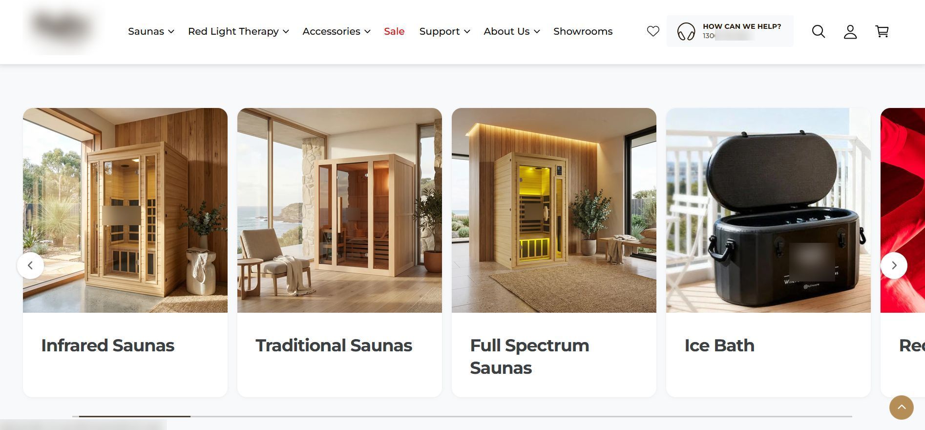
- Navigation. A multi-tiered mega menu that splits products logically by type (Infrared, Traditional, Outdoor) and size (1 to 4 person), helping users find the right fit instantly.
- Product Comparison Tool. The integrated comparison widget allows buyers to compare complex technical specs (EMF levels, heater types, dimensions) right from product cards and even the homepage.
- Trust & physical presence. Prominent display of showroom locations (Melbourne, Sydney, Brisbane, Perth), customer review counts (e.g., 4.9/5 stars across hundreds of reviews), and local support information builds solid buyer confidence.
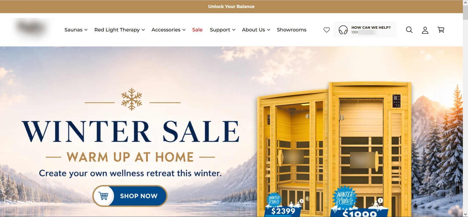
- Hero image is clickable and leads to the collection page.
Highest-Impact Opportunities
- Hero image is just an image again. From the marketing perspective, it does its function, but for the site owner, it would be nice to have the ability to update the full section from the admin area.
- Adding a cost calculator or a short quiz can retain a customer or maybe up-sell/cross-sell products.
- Tech optimization is not critical in this specific case, but still, it would highlight the company positioning and make it even more discoverable by search engines. Also, slight improvements to the mobile version can make the UX better.
Six-Lens Assessment(tm)
Business
Does the website clearly support the business goals?
This store has the announcement bar. Right now, it does not contain hot deals or any other valuable (from the marketing point of view) information, but technically this gap is covered.
The hero image is again just an image, hovewer, it’s clickable, and it contains CTA and deals info. The manager will need a designer’s help to redo the banner (so it cannot be done in two clicks), but from the marketing angle it’s fine. I’d optimize it for segmentation, probably adding three clickable elements:
- I’m new to saunas
- Compare models
- “Visit showroom” or “Browse all”
Marketing
Can the marketing team easily launch and promote campaigns?
This part is always tricky because I’m able to see only what I can see. I mean, I don’t know how this specific backend works, if they have some additional fields in the admin panel, etc. But based on the current page state, it seems the store is not completely ready for marketing campaigns:
- there’s no (visible) announcement bar
- hero image is just an image without any buttons or CTAs
- no visible email-capture or promotional mechanism. Depending on acquisition costs, I’d test a delayed or behavior-based offer rather than an immediate popup.
The hero image can be swapped easily, but I’d test whether reducing the number of steps between the homepage and a product page improves product discovery and conversion.
CRO
How easy is it for a visitor to become a customer?
The buying path is functional with quick cart features and comparisons, but high-ticket products require extra friction-reduction. Adding cost calculators directly to product cards, clarifying delivery/installation expectations upfront, and streamlining the hero CTA will make turning visitors into buyers significantly easier, and make the journey predictable.
Also, I didn’t see an email capture. I believe saunas are not an impulse-driven purchase, so people might consider multiple options and companies. Non-aggressive email opt-in might help retain a customer and make them come back. Moreover, a short quiz might be a great idea to show some options for this buyer specifically (the results can be sent to the email, too).
Moreover, for a $3,000-$5,000 product, payment psychology matters. The site already mentions payment-related options in some places, but I would make financing much more visible. For example: “From $99/month with payment plans” (not hidden at checkout).
Website maintenance services can help your store achive greater goals.
SEO
Can potential customers discover this website through search?
Strong foundation to be discovered via search engines too, not only paid ads. The store leverages localized SEO footers targeting key cities (e.g., “Infrared Sauna Melbourne”), regularly publishes educational blogs (“Infrared vs Traditional Saunas”), and includes detailed category structure, giving search engines plenty of contextual signals, including the purchase-intent content. The blog also gives search engines more trust signals.
Technical
Is the website fast, stable, and maintainable?
This store has some room for improvement. The current performance is 48 for mobile and 71 for desktop, which is common for Shopify stores. Page loading speed is acceptable for a media-heavy store, though optimizing background scripts and app payloads could improve mobile speed further.
Trust
Would I feel confident buying from this business?
After viewing the website, I have no questions in this regard. Physical showroom addresses, thousands of verified review ratings, clear contact numbers (1300 phone line), and dedicated warranty/support guides provide exceptional reassurance for a high-value transaction. If I were choosing a sauna, I’d definitely consider this company among the top variants.
Priority Recommendation
If I had one week to improve this website, I’d start by optimizing the product pricing presentation and conversion rate optimization. It will have an immediate impact and build a solid foundation for deeper analytics and further improvements.
Found that post interesting? Check out my previuos website review.