Disclaimer: This review is based solely on publicly available information and my observations as a web consultant. Since I don’t have access to the site’s analytics, A/B test results, or business goals, the recommendations below are hypotheses I’d prioritize testing rather than definitive conclusions. It’s a free and open review, so I highlight only several (probably most important) points here, it’s not a full-feature complete analysis.
Executive Summary
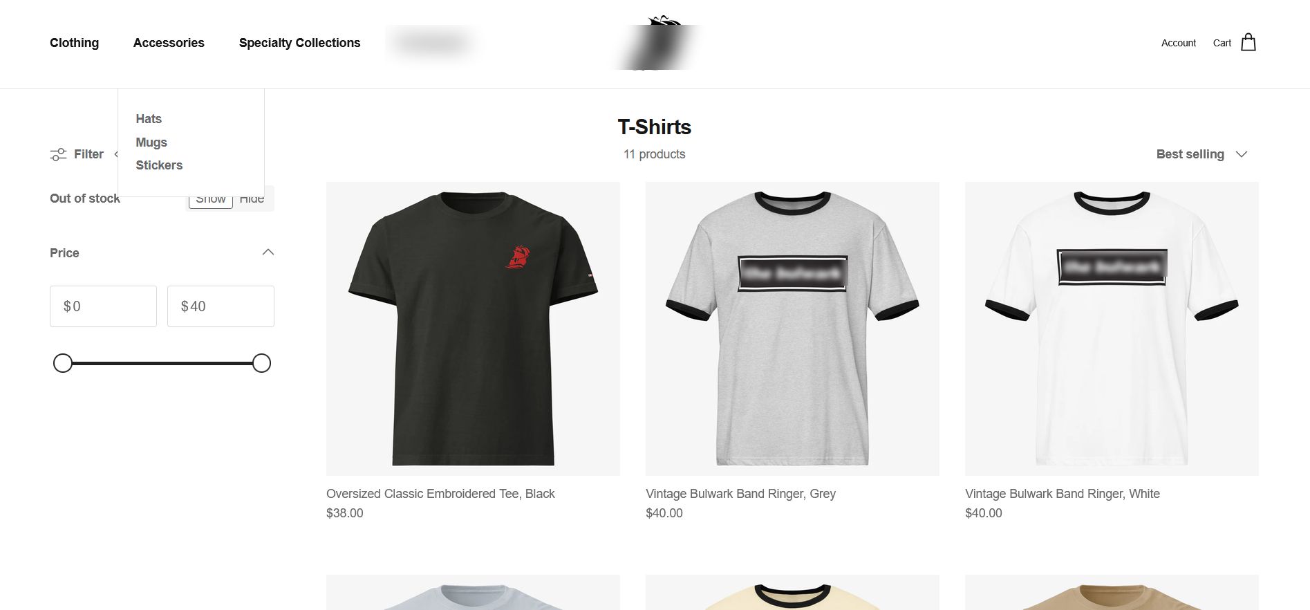
Business Context: This appears to be a merchandise store serving an existing audience that already knows the brand.
Industry: Apparel & Accessories
Stack/Platform: Shopify
Review Date: July 2026
Scope: Homepage and overall structure
Executive Summary.
Overall impression: A clean, professional Shopify store with a solid technical foundation.
Key Insight: The store already performs its primary function well. My focus wouldn’t be on redesigning it—it would be on helping more visitors discover products and making future marketing campaigns easier to run.
What works well
- Navigation
- Trust
- Performance
Top 3 priorities
- Improve homepage messaging
- Surface collections more prominently
- Build SEO content
Estimated effort: Medium
Why these priorities?
They affect the homepage, which every visitor sees, making them relatively quick to implement and easier to evaluate than longer-term initiatives such as SEO.
What’s Working
- Navigation. It’s good, clean, and minimalistic.
- Quick buy function. Great idea
- Trust. Professional presentation - the store feels polished and consistent, which helps build confidence when visitors are deciding whether to buy.
Highest-Impact Opportunities
- Hero image is just an image. While it might be ok from the brand/style POV, I’d test adding a stronger value proposition or call-to-action within the hero section. Also, I’d make it a bit smaller, since now it takes the whole screen, making users scroll much
- Only the featured collection and individual products are visible on the homepage. I’d put at least 3 collection banners and show 4 bestsellers from each, and add the “view collection” button. More collection entry points may help visitors discover products that match their interests without relying on search or scrolling.
- I’d enrich category and homepage content with useful copy that helps both visitors and search engines understand the products and the brand. Free traffic is never bad
Six-Lens Assessment(tm)
Business
Does the website clearly support the business goals?
From the business perspective, the message is pretty clear. The very first menu item indicates the core proposition - Clothing, and the hero image supports it. Products are actually good too (from the visual and structural point of view) - clothing and accessories. Professional and clean photos of the same size.
It’s not “one store for everything”, where you can buy fried chicken, a Zebra pen, and an iPhone backed up with a chewing gum from Alibaba.
Marketing
Can the marketing team easily launch and promote campaigns?
This part is always tricky because I’m able to see only what I can see. I mean, I don’t know how this specific backend works, if they have some additional fields in the admin panel, etc. But based on the current page state, it seems the store is not completely ready for marketing campaigns:
- there’s no (visible) announcement bar
- hero image is just an image without any buttons or CTAs
- no visible email-capture or promotional mechanism. Depending on acquisition costs, I’d test a delayed or behavior-based offer rather than an immediate popup.
The hero image can be swapped easily, but I’d test whether reducing the number of steps between the homepage and a product page improves product discovery and conversion.
CRO
How easy is it for a visitor to become a customer?
Speaking about conversions - it’s a decent, but generic Shopify store. People can easily buy stuff here (the Quick buy feature is really great), and it works as it should. But the user journey can be improved by adding CTAs (at least, for best-selling items), restructuring the homepage, adding a popup - not aggressively, but, say, after opening a couple of pages. Discount codes and email opt-ins would be useful here, too. But anyway, the store does its basic function, and it’s the most important part.
SEO
Can potential customers discover this website through search?
As I understand, it’s a brand store, so most clients either know about it or come to the store via the main website, so maybe SEO optimization is not a priority for the seller. However, it could be improved:
- by adding collection descriptions to improve organic visibility
- extending product details and description (for the same reason)
- adding the “About us” page or similar (“Our story”, “Brand philosophy”, a blog, or anything else)
From the tech point, the theme itself is mostly SEO ready (it has h1…h6 items, valid markup, but probably lacks a meta description).
This is where website maintenance can be handy.
Technical
Is the website fast, stable, and maintainable?
Surprisingly, this store has an 80 performance score on mobile (according to PageSpeed Insights) and ~96 on desktop, which is very, very good and rare for Shopify stores.
Page loading speed is comfortable - DOMContentLoaded: 708ms, full load: 1.5s, which is not perfect technically, but very comfortable for humans.
Trust
Would I feel confident buying from this business?
The site looks professional and consistent, including typography, colors, logo, and branding. It’s a brand store, and it has a link to the main website, where you can see real people (owners and guests). The store allows split the payment into multiple parts. They have a refund policy, which is usually a huge trust factor by itself. The “About us” section is lacking, but in this case it doesn’t break trust because most customers already know who stands behind it.
Priority Recommendation
If I had one week to improve this website, I’d start with the homepage because it sits at the top of the funnel: every visitor sees it, the changes are relatively fast to implement, and the impact can often be measured sooner than SEO improvements